MM // Mozart's Coffee
Mozarts Coffee
A Contemporary Look for an Old Friend
MM // Mozart's Coffee
Mozarts Coffee
back story
I’ve always had fond memories of local coffee roaster Mozart’s Coffee Roasters. It was a mainstay of my high school years. Whether it was scorching hot or freezing cold my group of friends and I always seemed to always meet up at the little roaster on the lake to hang out and talk. Time has since caught up to the coffee shop and it seemed like a good basis to try to revamp and freshen up their overall design a bit.
Goal
Mozart’s had three key areas I felt they were weak in, namely, an old raster Logo, an unresponsive website that wasn’t mobile friendly and a menu that suffered from what I call, information sprawl. Information sprawl is where one large chunk of information spread out over multiple units of delivery or locations. I felt the right direction moving forward would be to redesign the logo, redesign from the ground up the businesses website and adding a big beautiful motion menu that contained all that they offer in one singular place.
Tools
Deliverable
Logo, Identity, BC, Website
Tags
- Identity
- Motion
- Web
Quick Links
Deliverable
Logo, Identity, BC, Website
Tags
- Identity
- Motion
- Web
MM // Mozart's Coffee
Logo Revamp
Better scaling & Legibility through Vector
There were four main goals for the Mozarts logo revamp – First, the new logo must be in vector to replace the old raster image, for better flexibility in both print and web design. Secondly, improve the overall legibility of the logo. For example, the banner tag underneath the logo in particular is barely legible. Another goal of the project is to free up trapped negative space within the mark itself. Finally, it is a top priority to recreate the overall feel that is reminiscent of the old logo.
Original & Revamped / 1920 x 1080
MM // Mozart's Coffee
Motion Menu
Curing Information Sprawl
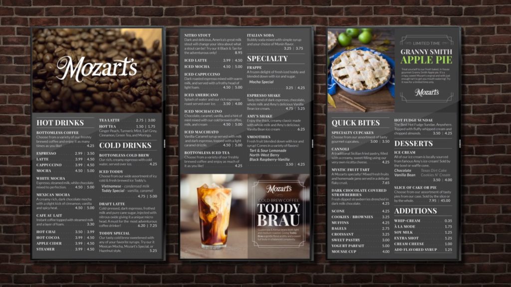
It quickly became clear at the cafe that what foods and drinks they offered were found in multiple areas and in multiple menus. No single menu contained all the items available to the customer. This is what I refer to as, “information sprawl”. Multiple pieces of information spread out over multiple pieces of information delivery. To remedy the sprawl, I thought this would be a great place to incorporate a motion menu.

Motion menu still mockup / 1920 x 1080
The Benefits of motion
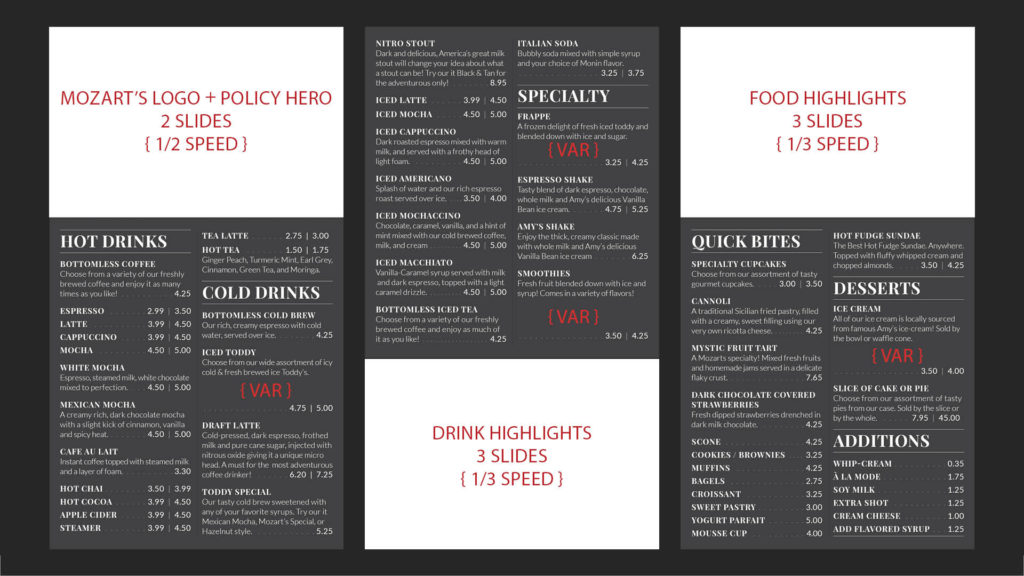
Motion menus have amazing benefits. Motion menus are easy to modify and can be done at a low cost, contrary to printed menus, or worse yet, a custom painted menu. (Ironically, the cost of print expenses are typically the reason for information sprawl). The cost of large, thin and lightweight televisions have become ridiculously cheap considering their size. They are eye catching to the customer and can even incorporate video if needed. They can help promote certain specials or items a business is trying to push. Finally, since the design is not static, you can incorporate a larger volume of information for the customer on them.

Timings of video, specials, and flavor varietals.
MM // Mozart's Coffee
Website
Old Website gets a new make over
The next step of Mozart’s refresh was to redesign the businesses website, which had aged quite poorly. Mozart’s Coffee Roasters website had four main problems. First, the site was not responsive at all. This made mobile usage, which is key for a service orientated business, particularly challenging. Secondly, the website felt visually “bolted together” using random bits of freely available code. Third, the UI was very confusing. Some active pages were seemingly inaccessible through the site’s home page and could only be found through very specific Google searches. Finally, the site didn’t feel completely comprehensive, with large chunks of information, particularly menu items, missing.

MM // Mozart's Coffee
Website
A More Compelling site
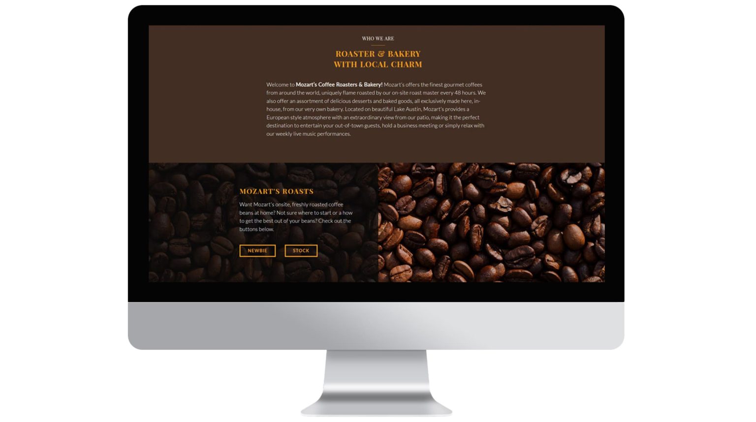
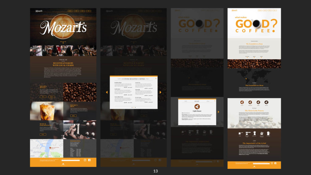
The Mozarts website was designed. The redesign is complete in HTML 5/CSS3 and is 100% completely responsive. Care was also taken to ensure certain functions that make navigating the mobile version is easy such as anchors for larger sections.
Home page was designed for those seeking quick information. For example, location, business hours and contact. The website also features the full, complete menu – for drinks (hot/cold), desserts, etc. I also added a page that I called the newbie section. One of Mozarts key selling points is that they roast their coffee on site. With that kind of expertise, it seems like a natural fit to incorporate a page that educates the user of different aspects of the caffeinated lifestyle.

Mozart’s website pop up menus.
MM // Mozart's Coffee
Identity
Crafting the Visual Feel
Color Scheme
- HEX - #2D1E1D
- HEX - #422E23
- HEX - #D16D18
- HEX - #F49C20
- HEX - #F9F3E2
Playfair Display SC
To add an element of class and friendliness, I choose Playfair Display SC (weights: 100, 400, 600, 800). An off-shoot of Bodoni, Playfair is great for adding character, class, and contrast to brands.
Lato
Mozarts Coffee’s main utility Typeface is Lato. (weights: 100, 400, 600, 800). Lato is clean, modern sans serif that scales well, comes with a variety of weights for contrast, and maintains legibility at smaller sizes.