M2 // BHC
Bighorn Construction
Inspiration
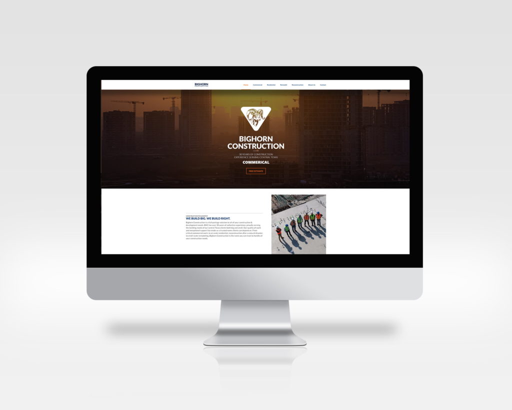
A small local business Bighorn Construction gave me a call and wanted to extend their presence on the web. They are a young company but the team there is comprised of industry veterans. They handle a wide variety of capabilities from commercial construction, residential, custom remodels, and reconstruction.
Goal
Create a friendly website that give the BHC company a presence on the web to compliment their strong word of mouth model. The website should include three email account,a functional contact form, and designed for speed for ranking. This would include SEO and image compression and image otimization.
Deliverable
Website
Tags
- Identity
- Motion
- Web

M2 // BHC
Website
Editorial Design
I have always been fascinated with true stories of government espionage, techniques in tradecraft and modern U.S. military surveillance capabilities. This particular subject has always seemed to endlessly captivate me. This project, The System, was created with the love of this subject in mind and was directly inspired by Laura Poitras’s 2014 documentary, Citizen Four, which was based on NSA whistleblower Edward Snowden. It covers a wide array publicly known surveillance programs exposed in the wake of the Snowden leaks.

1280 x 720 / CLWW
M2 // BHC
Identity
Crafting the Visual Feel
Color Scheme
- HEX - #303030
- HEX - #1079ea
- HEX - #23a3dc
- HEX - #e0e0e0
- HEX - #ffffff
Typography
CLWW uses Lato. (weights: 100, 400, 600, 800) Lato works well small and is freely available for web and Print. Post project ease of availability (Google Fonts) was a consideration for choosing the typeface for ease of use in the future for the client.
M2 // BHC
Thumbnails
Inspiration
The Kyle Coopers title sequence to Seven heavily inspired the overall direction of the System. Watching it I noticed that the book being created used different types of semi opaque paper like vellum and, if you watch closely, seemed to use printed transparencies. I decided that using transparency for the title page would make quite an impression on the viewer. The viewer is greeted with a field of random letters but by turning the page subtracts the useless data and reveals the hidden message within the code.
1920 x 1080
M2 // BHC
Logo
Three Services
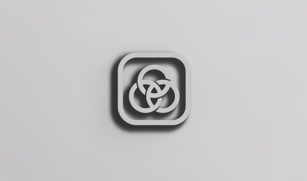
While CLWW is concentrated on audio, the owner did not want a logo that relied on the usual audio troupes like meters or wave forms. Being that CLWW focused on three primary areas (recording production, equipment repair, and custom audio environmental baffles) I introduced the idea of three overlapping services represented by three overlapping circles. The idea came from RGB colorspace overlays. Instead of a flat overlap, I instead choose a monospaced stroke with spacing to help reinforce the idea of the overlapping areas.
Primary
Alternate
Prime Invert
Alt Invert

M2 // BHC
Usage
Inspiration
During this time I became oddly interested in phone photography and experimented with a cheap Iphone macro lens I found at Frys. I was pleasantly surprised at just how well it worked. The image, a slightly curled one-hundred dollar bill, allowed me to use the lens depth of field to emphasize Benjamin Franklin’s eyes. The image is vertically cropped tightly to give the impression of Ben, symbol of the government, peeking in on the viewer.
11×17. 1/16 bleed. 300 dpi.