M2 // Project #12
The Mighty
Young Buck
Quiet still Life
M2 // Mighty Young Buck
Mighty Young Buck
Inspiration
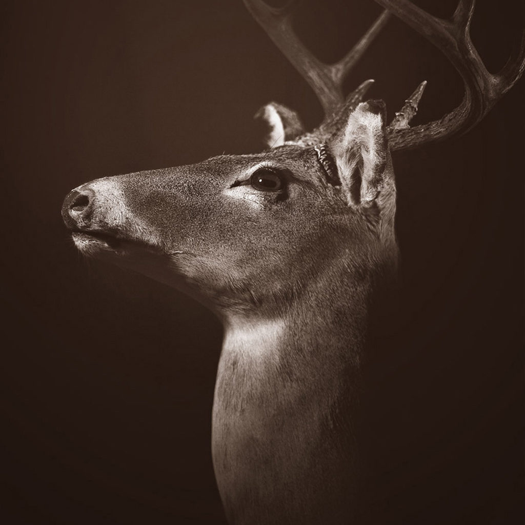
Inspired by Japanese photographer Hiroshi Sugimoto and his astounding work on in his Dioramas series, I tried my hand at capturing taxidermy in a life like manner. Luckily at the time I was a working at a small bar just outside of Austin called Down South Railhouse (a.k.a. – DSR). It was a country bar filled with country things, numerous of which was a handful of mounted animals. I also worked on DSR’s graphics at the time for their printed and social media materials. The mount I chose was a particularly well crafted piece that I dubbed, “Buck”.
Scope
The System (or TH3 SY5T3M) was designed to be a visually schizophrenic open-ended coffee table book, utilizing my own personal experimentation with post-modern typography. The book itself is hand-bound using a technique proposed in The Vignelli Canon and incorporates personal artwork including macro photography [cover image] and the use of layered transparency effects.
Tools
Deliverable
Logo, Identity, Business Card, Website
Tags
- Identity
- Motion
- Web
Quick Links
Deliverable
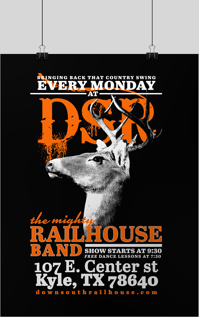
Promo Poster
Tags
M2 // Mighty Young Buck
Layout
Editorial Design
I have always been fascinated with true stories of government espionage, techniques in tradecraft and modern U.S. military surveillance capabilities. This particular subject has always seemed to endlessly captivate me. This project, The System, was created with the love of this subject in mind and was directly inspired by Laura Poitras’s 2014 documentary, Citizen Four, which was based on NSA whistleblower Edward Snowden. It covers a wide array publicly known surveillance programs exposed in the wake of the Snowden leaks.


M2 // Mighty Young Buck
Cover
Inspiration
Being a relatively low lit venue, I designed the poster with high contrast in mind, and kept the color pallete to a limit of three colors – black, white and Hunter Orange. I believe my use of Hunter Orange goes without explanation.
While I am not a big fan of the Bleeding Cowboys typeface, I choose to use it to use it in order to keep in line with the business’s previously established identity system. I believe that it was an important decision, that many of my peers disagree with. It’s ok to disagree with the company’s identity choice, but I believe that it is tremendously important to work within that established framework. It is consistency that gives identity systems their power. A designer to randomly pick and choose what part of the system to use, only with the idea of personal taste or ideal in mind, is to undermine the very point of the system itself. It is important to place the work you do for a brand above yourself and have it service something larger.
11×17. 1/16 bleed. 300 dpi.